Category Archives: Frankenstein

“Milton,” by Nana Kodjo Acquah – Asare

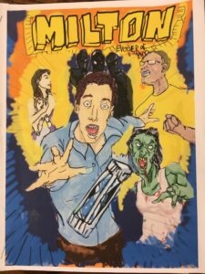
The cover art for “Milton,” by Nana Kodjo Acquah – Asare

Nana Kodjo Acquah – Asare’s short graphic novel Milton (illustrated by Smite, lettered by Cleopatra) explores the themes of scientific overreach, self-serving ambition, and faceless corporate greed. The narrative structure draws on the conventions of the comic book genre, beginning in medias res before hinting at the title character’s “origin story” in a series of flashbacks. This choice allows Acquah – Asare to tell a very complex story in a relatively short space.

The plot itself derives in large part from Frankenstein, Oryx and Crake, and contemporary zombie mythology (particularly 28 Days Later). Yet Acquah – Asare’s attention to detail reminds us that this is an homage, not a derivative: the laboratory in particular includes a portrait of Frankenstein’s Creature hung proudly, like a family member’s, on the wall, while a book titled Adam and Eve recalls Milton’s namesake.

It’s interesting that the title character takes his name from the author of Paradise Lost rather than from a character in any of the works in the long tradition of mad-scientist stories. Perhaps this choice indicates that the author is the maddest scientist of all.

Is Milton being kept artificially alive in the last frame? We will have to wait for the next issue to find out…

kodjo

“My Monster Roommate,” by Alexander Aminov

Aminov-project

In My Monster Roommate, a script for a three-act episode of a new sitcom, Alexander Aminov reimagines Mary Shelley’s Frankenstein in a modern setting. As he notes in his reflection, the plot of Shelley’s gothic novel lends itself surprisingly well to the conventions of the sitcom, with stock characters, catchphrases, unlikely scenarios, and repetition all readily at hand. The result is a bit screwball with a lot of puns and tongue-in-cheek literary references (and, of course, the all-important swinging kitchen door).

Aminov picks up on a number of the novel’s more uncomfortable moments, and with a knowing wink to the audience turns the textual source into part of the joke (as with the running joke that Elizabeth isn’t Victor’s cousin “in this version”). Yet even as Aminov gently pokes fun at his characters, the scenario itself echoes Shelley’s most important message: our ability to feel with the “monster” is what makes us human.

Creative Commmons license BY NC ND
CC BY-NC-ND

“An Alternate Timeline to Frankenstein,” by Hiroyuki Uokawa

uokawa

In “An Alternate Timeline to Frankenstein,” Hiroyuki Uokawa imagines a version of Mary Shelley’s classic novel in which Victor Frankenstein does not abandon his creation, but instead teaches him and protects him from the world. Using a comic book form, Uokawa is able to draw on visual details from the novel, like the rain that poured down on the night of the Creature’s creation, as well as from the later visual tradition of Frankenstein, such as the neck bolts reminiscent of Boris Karloff’s Creature in James Whale’s 1931 film adaptation of the novel.

While the comic lacks the nuanced conflict of the novel, the comparison forces readers to question our judgment of the novel’s Victor Frankenstein. Even if the Creature (Tom in Uokawa’s version) had been raised by his creator, Uokawa suggests, the prejudices of society would make him a virtual prisoner in his own laboratory. In this version, a family (possibly a reference to the De Laceys), cast stones at Tom the first time he tries to explore the world outside. The concluding panels — in which Victor laments that he did not make Tom “normal,” and offers to one day give him a makeover — draw our attention to the enforced normativity (and capitulation to normative values) that uphold a prejudiced society.

Creative Commmons license BY NC ND
CC BY-NC-ND

“ChickieNobs,” by Alfiya Valitova

In her sculpture ChickieNobs, Alfiya Valitova explores the role of disgust in shaping ethical responses to scientific innovation in Margaret Atwood’s Oryx and Crake. The ChickieNobs of the novel are a project developed by the AgriCouture students at the Watson-Crick Institute, designed to efficiently produce edible chicken parts. The “chickens” have been genetically engineered for maximum efficiency, with legs or breasts growing around “a mouth opening at the top.”

While the AgriCouture students focus on pure capitalist efficiency, Valitova’s project highlights the scabs, scars, blood, and regrowth that provide uncanny reminders that even genetically engineered “chickens” are still, in some way, living beings. Her sculpture, made of a special blend of flour clay/putty that dries with a flesh-like texture, elicits an immediate shudder of disgust — the same, Valitova writes, that she felt on reading Atwood’s novel.

While Crake compares the structure of the ChickieNobs chickens to “the sea-anemone body plan,” Valitova draws on more familiar household objects to heighten the sense of the uncanny. The shape of her sculpture resembles a cactus while the arrangement of knobs growing out of fleshy craters recalls the seed pods of the lotus plant. The sculpture itself is “planted” in a ceramic planter, suggesting that a renewable ChickieNob “plant” might find a home in a window-box alongside basil, sage, and mint. Valitova’s materials likewise connect ChickieNobs — an emblem of mass-produced food — to the personal kitchen: as she writes in her reflection, “the recipe” for the clay “is not that different from a regular bread recipe.” In this way, her project highlights the Freudian sense of the uncanny as “unheimliche” or “unhomely” — the horrifying mixture of the familiar with the unfamiliar.

Yet by intentionally provoking a trypophobic response in her audience, Valitova might subtly suggest a gendered reading. Like Carolee Schneemann’s Meat Joy, Valitova’s ChickieNobs uncomfortably link eroticism, food, flesh, and the home, forcing us to consider why this particular combination of symbols is so particularly disgusting.

Creative Commmons license BY NC ND
CC BY-NC-ND

“Paradice” promotional pamphlet, by John Carty

carty

In this pamphlet, John Carty imagines promotional material for Paradice, the corporate lab run by Crake in Margaret Atwood’s Oryx and Crake. As Carty notes in his reflection, Jimmy, the novel’s narrator, worked in corporate publicity, developing the slogans and pseudoscientific jargon that would help sell unnecessary and often harmful drugs and supplements. Carty’s pamphlet, however, would be unlikely to convince anyone who read the fine print to buy in. Rather, under the soothingly familiar headings Community, Sustainability, Opportunity, and Commitment, the imaginary author of the pamphlet snarkily undermines Paradice’s slick corporate image. As Carty says in his reflection, he imagines the author to be a disgruntled employee seeing how much he can get away with — as relatable a character in a dystopian future as in current corporate America.

To list all the clever details in this work of conceptual art would be to spoil the audience’s fun. But two details are too good to pass by without note. The logo Carty chose for Paradice resembles neither Paradise nor a pair of dice; on first glance it perhaps looked like an orange slice with thick skin, three segments, and very symmetrical seeds. On second glance, however, it appeared to be a cog — a reference both to the lab’s scientific endeavors and to the author’s role as a cog in the corporate machine. On the back panel, readers are encouraged to “Like us on Facebook” — whether we should be comforted or horrified by the assumption that Facebook will continue to exist in the dystopian near future remains unresolved.

CC BY-ND

“Paradise Lost,” the board game, by Vincent Patti, Erica Simon, and Christopher Soto

In this board game, designed by Vincent Patti, Erica Simon, and Christopher Soto, players engage with the major themes of Milton’s Paradise Lost in a loose Candy Land-like structure. Players need not have read Paradise Lost to enjoy the game; in fact, as Soto points out in his reflection, the game could be used as a way to introduce the poem to children old enough to play board games but too young to appreciate Milton’s epic.

As Simon notes in her reflection, the imagery of the board game is drawn directly from Milton’s descriptions. The group paid careful attention to opposites, such as light and dark, to represent the opposing forces of good and evil, and mixtures of color to represent chaos. “Like a painting, a board game can convey ideas through its images and visual design,” Patti explains in his reflection, but unlike a painting, a board game enables its audience to “interact with the world” portrayed. This interaction is facilitated by ? cards, some of which take effect immediately, others of which can be held by the player for future use. Each card refers to a concept or event in Paradise Lost, and many quote directly from the poem.

While the game form is appropriate for all the reasons given by Patti, Simon, and Soto in their reflections, the mixture of skill and luck required to win also reflect the balance of free will and fate at the heart of the poem itself.

CC BY-NC-SA

“The Importance of the Left and Right Brain,” by Katrina Olynyk

“The Importance of the Left and Right Brain,” by Katrina Olynyk

Katrina Olynyk’s final project, “The Importance of the Left and Right Brain,” draws on the (now mostly debunked) theory of the double brain, long used in literary scholarship as a lens for analyzing Robert Louis Stevenson’s The Strange Case of Dr. Jekyll and Mr. Hyde. Olynyk extends the work of scholars such as Anne Stiles, who have argued that the dual personalities might be understood as a “double brain,” to consider the importance of the left-brained vs. right-brained theory as a characteristic device of the science fiction genre.

Olynyk’s painting uses color, symbolic imagery, selective text, and lines to illustrate the two-brain theory. The painting refers back to both Jekyll and Hyde and Oryx and Crake. One of the most fascinating elements of the painting is the repetition of five key words from Oryx and Crake in both halves of the brain (in different arrangements). These words, which Snowman collected and which — as Olynyk points out — represent the various branches of the humanities, come to represent the power of language to connect analysis and creativity, even as they represent Snowman’s own role as mediator between Crake’s world and Oryx’s.

Creative Commmons license BY NC ND
CC BY-NC-ND

“Reinterpretation of Frankenstein,” by Sara Bashary and Julianne Fiorino

“Reinterpretation of Frankenstein” by Sara Bashary and Julianne Fiorino

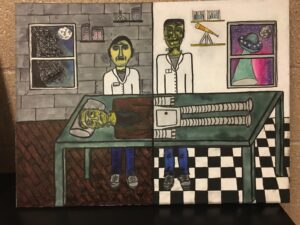
In their “Reinterpretation of Frankenstein,” Sara Bashary and Julianne Fiorino imagine a narrative in which Victor Frankenstein, rather than abandoning his creation, nurtures him and teaches him to share in his creator’s scientific pursuits. While this alternative fiction allows Bashary and Fiorino to explore the role of education in Shelley’s Frankenstein, the conceit also allows them to explore the connections between Shelley’s novel and contemporary science fiction. They imagine that a well-educated Creature, trained by Victor in the art of creation, has survived into the 21st century to carry on his maker’s work. However, rather than creating new people out of dead bodies, Creature follows the trajectory of science fiction over the past 200 years and turns to robotics or AI. In this way, the story of how Shelley’s “hideous progeny” — as she termed her novel in the 1831 introduction — went forth and prospered merges with a vision of Creature himself prospering across the ages.

Bashary and Fiorino use illustrative detail, visual allusion, and careful symbolism to depict their story in a painting. While the stone walls of Frankenstein’s lab are reminiscent of a Gothic aesthetic appropriate to the Romantic era, the sterile white walls and colorful UFO of the Creature’s lab reference Mid-century visions of the future (possibly by way of Futurama). Additionally, Victor’s jaundiced pallor provides a visual parallel to the Creature’s skin; the major distinction between the two figures are the classic neck-bolts of Boris Karloff’s 1931 performance, suggesting that the two characters are separated more by their later interpretations than by any actual difference in character.

Creative Commmons license BY NC ND
CC BY-NC-ND

“Never Let Me Go,” by WahYing Yuen

A drawing representing Kazuo Ishiguro’s “Never Let Me Go,” by WahYing Yuen

In this morally sensitive project, WahYing Yuen responds to the injustices portrayed in Never Let Me Go and relates them to broader societal injustices. While the sketch might not immediately call Kazuo Ishiguro’s novel to mind, Yuen’s careful reflection explains how she uses symbolism, color, and visual metaphor to explore the same ethical concerns as Ishiguro.

In this drawing, we first see a healthy tree and its watery reflection. We would assume that these two trees would be identical, and we would call one a real tree and the other an illusion or pale imitation of the real tree. On closer inspection, however, the viewer notices subtle differences: the reflection is paler and almost jaundiced, while the soil-bound tree is hearty and strongly colored; the reflection’s blossoms and leaves are already turning color and falling, while the blossoms and leaves on the soil-bound tree remain vibrant. As Yuen points out in her reflection paper, these differences demonstrate how the soil-bound tree drains nutrients from the reflection, just as the healthy citizens in Never Let Me Go maintain their health through the suffering of the clones.

A reflection clearly cannot exist without the object or being it reflects — yet Yuen reverses this relationship, suggesting that the metaphorical tree cannot exist without (exploiting) its reflection. In this way, Yuen’s project might be seen as responding to any number of texts that we have read for this class in its suggestion that even inadvertent “creations” share the same ecosystem as their creators; they are integral and vital to that ecosystem; and they deserve the rights they are so frequently denied.

Creative Commmons license BY NC ND
CC BY-NC-ND

“Second and Worst Self,” by Melissa Orsano

In this four-panel strip, Melissa Orsano transforms Dr. Jekyll and Mr. Hyde into “Second and Worst Self,” a modern-day reinterpretation of Robert Louis Stevenson’s classic novella. In Orsano’s retelling, the tale becomes an indictment not of scientific overreach, but of the contemporary beauty industry and its effects on young women’s sense of self.

Orsano uses consistent imagery and readily interpreted symbols — such as beauty magazines, a bottle (first intact, then broken), blacked-out features, and shadows — to tell a cohesive story. While the first two panels tell the familiar story of an insecure young woman who destroys herself striving for impossible beauty, the third panel complicates this narrative and connects the tale to Dr. Jekyll and Mr. Hyde by incorporating text from the novella. In a repeated phrase, written in red ink and in a manner reminiscent of bathroom graffiti, partially obscured by the young woman, whose features are also now obscured, we are reminded of how Dr. Jekyll perceived his “self” as “lost.” By underlining a different word in each iteration of the sentence, Orsano constructs a new sentence, underscoring the act of transformation that is both the subject and the structure of her project. In the final frame, the transformation is complete. Orsano leaves no room for redemption of the lost self.

Read Orsano’s reflection here.

Creative Commmons license BY NC ND
CC BY-NC-ND